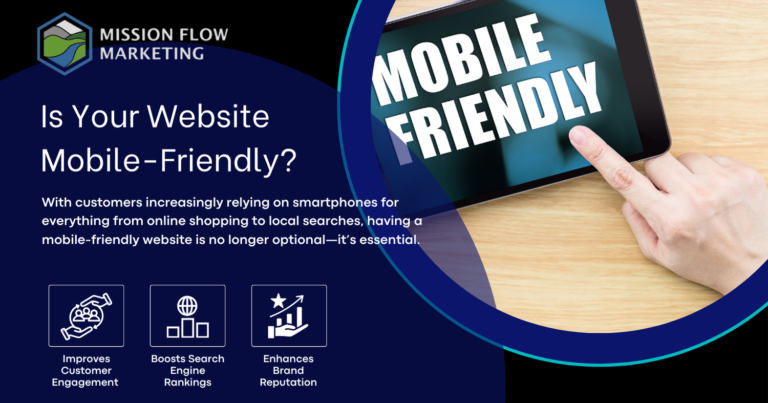

In today’s digital world, mobile devices account for a large portion of internet traffic. With customers increasingly relying on smartphones for everything from online shopping to local searches, having a mobile-friendly website is no longer optional—it’s essential. If your website isn’t optimized for mobile, you may be missing out on valuable traffic, sales, and customer loyalty. Here’s why mobile-friendliness is so critical and what it can mean for your small business.
A mobile-friendly website is designed to adapt seamlessly to different screen sizes and devices. This includes smartphones and tablets, providing a smooth and enjoyable experience for users regardless of their device. Key characteristics of mobile-friendly websites include:
Customers expect a website to be easy to use on their mobile devices. If your website is difficult to navigate, loads slowly, or requires constant zooming, customers are likely to leave. Mobile-friendliness directly affects how long visitors stay on your site and how likely they are to take action, whether it’s making a purchase, booking a service, or contacting you.
Search engines like Google prioritize mobile-friendly websites in search results, especially for mobile users. This is known as mobile-first indexing, where Google evaluates the mobile version of your website before the desktop version. A mobile-friendly site can help your business rank higher, making it easier for potential customers to find you.
A website optimized for mobile users offers a frictionless experience, reducing the steps needed for customers to complete a purchase or fill out a contact form. Small design changes, like having large, tappable buttons and simple, one-click actions, can significantly boost your conversion rates on mobile.
In today’s competitive market, having a mobile-friendly website can set you apart. If your competitors have optimized for mobile and you haven’t, you risk losing customers to them. Staying mobile-friendly ensures that you’re meeting (and exceeding) modern customer expectations.
A professional, well-designed mobile website reinforces your brand’s credibility and trustworthiness. Customers are more likely to trust and return to a site that provides a positive experience on their phones, which can lead to stronger customer loyalty and word-of-mouth referrals.
Wondering if your site is mobile-friendly? Here are some easy ways to check:
A mobile-friendly website isn’t just a trend; it’s a necessity for connecting with today’s customers. By optimizing your site for mobile, you’ll improve customer experience, boost your search rankings, and increase conversions—all of which are vital for small businesses.
Are you ready to make your website mobile-friendly and capture more customers on the go? Contact Mission Flow Marketing for a free quote today! We specialize in creating mobile-optimized websites that help small businesses thrive in an increasingly mobile world.